Category: Wonderful Words

A Making

I came across Hollie McNish when a friend posted a poem of hers on Facebook about breastfeeding

Since then, I’ve been keeping an eye out for her work and I’m hooked!

I have a slightly unresolved relationship with poetry, on the one hand it ticks all of the boxes under Things I Like About Language – precision, rhythm, mouthfeel and cadence. On the other hand, I sometimes find it’s too self-conscious and I don’t tend to search it out as reading material.

But now that I think about it, it may be like my mother’s infamous coriander/cilantro difficulty* and a change of intellectual bias is all it takes.

If you’re not a fan of receiving information by video,  here is a chance to read one of Hollie’s poems yourself.

*She likes coriander but not cilantro.

Fred Aldous Guest Post

I recently wrote a guest post for Fred Aldous, so I thought I’d introduce you to one of my favourite art shops!

Fred Aldous has been trading in Manchester since 1886, and while fashions in beards come and go, they have steadily supplied a truly astonishing range of art supplies. Time was when the Lovely Young Man wasn’t so keen on letting me go in unattended for fear I would spend all of the beer and cereal money on exciting sketchbooks.

In addition to selling some of my very useful supplies, such as hoops, mini canvases and Leuchtturm notebooks they have studio spaces where you can try your hand at laser cutting, borrow a photo studio or try their photo booth out!


If you’re not local, they’ve got a great online shop (but I can definitely recommend poking around in the shop if you get a chance, you can tell how serious your art supply addiction is by how far down the various sets of stairs you wander.)

Here’s a copy of my post, or follow the link to explore more Fred Aldous.

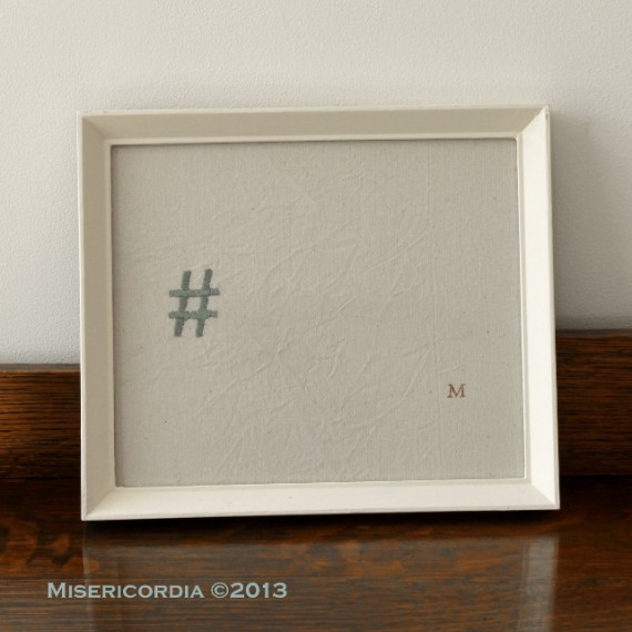
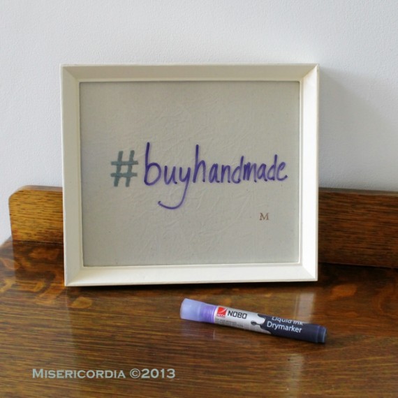
My name is Katy Bromberg and I create hand embroidered text art in Edinburgh as Misericordia.

I love you - I know hand embroidery - Misericordia 2013

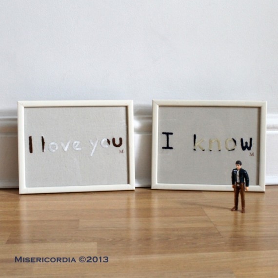
I am very interested in the interplay between text and context; or what our experiences bring to our interpretation of a word or phrase. Particularly since communication is veering away from text which is shaped by our hands or voices, I want to explore the additional meanings that can be brought to mechanically produced words by font and colour.

Joy hand embroidered hoop - Misericordia 2012

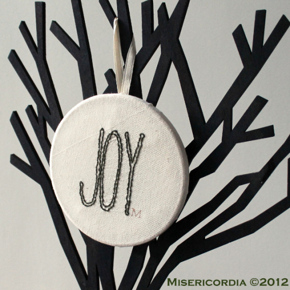
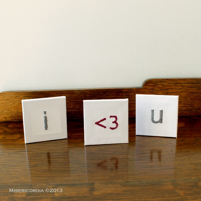
I have chosen to present my work as framed pieces rather than, for instance, cushions or other housewares because I want my work to give text a value that is not utilitarian. There is so much text washing over us these days that I wanted to allow words to have the space to linger in the mind and on the tongue. The hoops and mini canvases from Fred Aldous give me a way to make less formal pieces while still giving each word or letter an iconic status.

I Love You hand embroidery - Misericordia 2013

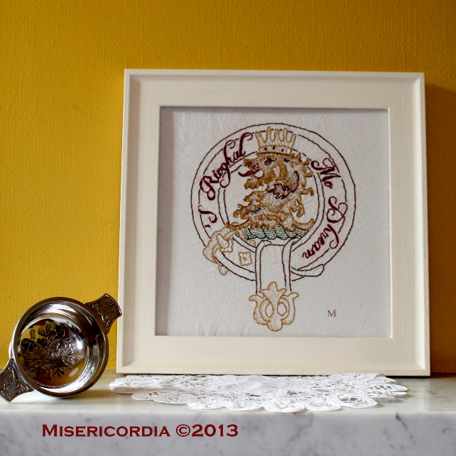
I use hand embroidery for the same reason, it brings an analogue finish to what is essentially a digital form of communication. Working by hand also gives me time with each piece. Sometimes I feel like I am being guided by the piece more than being in charge of its creation. This lion had some very particular ideas about how he was going to present himself!

McGregor Clan Crest hand embroidery - Misericordia 2013

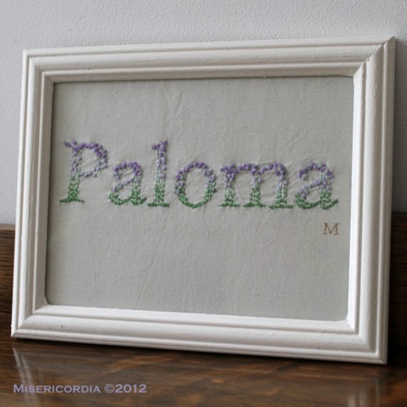
Even in my commissioned work, I can sometimes send subtle messages while still giving the customer control over their piece. For instance, I used the colours of the Suffragette movement in this baby’s name piece in the hopes that it would inspire courage and dedication to good causes.

Paloma hand embroidery - Misericordia 2012

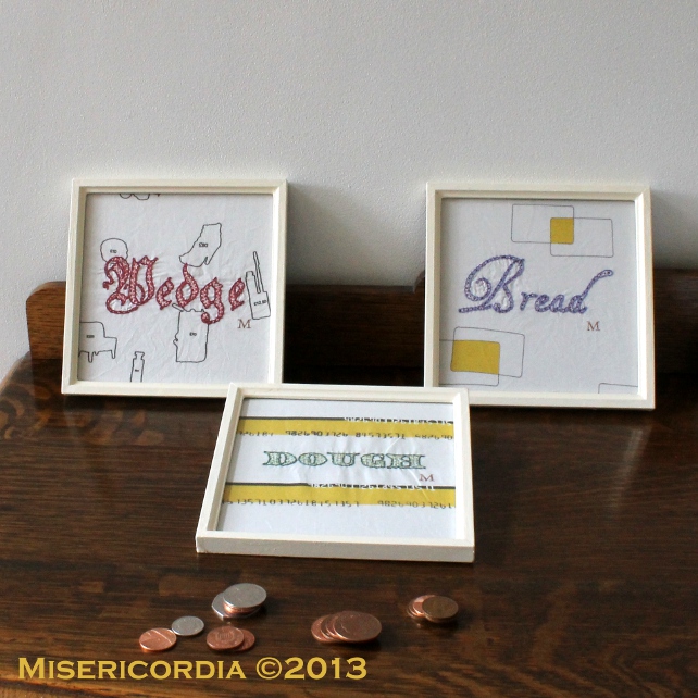
Earlier this year, I had an exhibition at Trove in Levenshulme, Manchester. The work explored the relationship between food and other human appetites – love and money. The Staff of Life used fabric I had designed around the idea of endless consumption with fonts and colours inspired by currency.

Staff of Life hand embroidery - Misericordia 2013

Sweet Nothings demonstrated just how monochrome our favourite terms of endearments are.

Sweet Nothings by Misericordia 2013

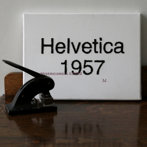
Sometimes, it’s all about the font. Inspired by a friend’s love of mid-century modern, I decided to make a hipster sampler.

Helvetica hand embroidered canvas - Misericordia 2012

…and no discussion of the most perfect font can be complete without its antithesis – Comic Sans. (One to annoy the graphic designers.)

Seriously hand embroidery - Misericordia 2012

I’m always looking for new ways to encourage people to think about their words, I’d love to hear what you have to say!

Hashtag Unknown hand embrodiered notice board - Misericordia 2013  Hashtag Unknown hand embrodiered notice board - Misericordia 2013

www.misericordia.co.uk

Take a Memo

Before we start, here’s a small point of admin. The final commission date for UK deliveries before Christmas is a week from today – Friday 29th November. The last posting date for UK delivery is Friday 20th December if you are pondering stock pieces.

People often look at my work and comment on the patience that it must take to do embroidery. (I have to say that I find it requires less patience than herding a toddler, so it’s quite restful.)

Now it’s my turn to marvel at the motor skills that allow Keira Rathbone to produce these gorgeous pieces.

Hammersmith Bridge - Keira Rathbone 2009

Hammersmith Bridge – Keira Rathbone 2009

Not sure how she did it? Here’s a hint!

My Weapons of Choice – Keira Rathbone

You can watch a video of Keira at work on the BBC website, it’s absolutely worth a look.

Not only does this make embroidery look like the easy option in terms of co-ordination, I’m super impressed that she works en plein air.

So if you need some typerwriter art in your life, please pop over to Keira’s website and shop.

(I feel the need to add the noise of the carriage return at this point, please oblige me by saying ‘ping!’ right….now.)

Dear Sir,

Even though I’m a child of the email generation (we were seriously early adopters, the perks and perils of academia) I like to think there’s a healthy letter-writer lurking in my soul.

Letterpress Cards from Rack and Ruin on Folksy

Letterpress Cards from Rack and Ruin on Folksy

I must admit that my letter writing these days is mainly restricted to thank you notes (never start with the word ‘thank you’) but I do like to know what should and shouldn’t be done.

“If you write to a Queen, begin your first line within three fingers breadth of the bottom of the paper” – Philip, second Earl of Chesterfield

For entertainment of my (future) grandchildren I have saved a rather large number of letters received mainly between the ages of 13 and 18.

…I’ve just realised quite how excruciating those are going to be! Maybe I should get writing so I can also leave some more creditable evidence of my epistolary efforts!

Luckily, the BBC has helpfully compiled a list of 10 letter writing tips that you can use over email, even if your correspondence card collection is a little low!

10 old letter-writing tips that work for emails - BBC website

10 old letter-writing tips that work for emails – BBC website

If your stationery selection is low,  do click on the image of the gorgeous letterpress cards to do some shopping!

Pressing Away

Among the changes and upheavals this year, I went vegetarian in June. The strange thing is that I haven’t been able to explain either to myself or anyone else quite why it happened.

I’ve always been a bit of a hippy and when I was a carnivore we were trying to reduce the quantity and increase the quality of meat we were eating. But I found myself avoiding it more and more without being able to say why until I realised that the way to become a vegetarian was to just stop eating meat (I know…but I’m new to this kind of thing).

Even now that I’m not a meat-eater, I can still hold a conversation like one. I cook meat for LYM and Dragon but I just don’t want to eat it. Sometimes I miss the emotional resonance surrounding certain foods*, but in the way I imagine a smoker misses the ritual of smoking more than the consumption of toxic fumes.

And then I read a post from the eloquent and perceptive Adult Beginner in which she discusses (among other things) a quote from Peter Fonseca in The Dancer’s Body Book By Allegra Kent

So many people just consume and consume and don’t put anything out. I think the answer is to be absolutely minimal in what you take in and prolific in what you put out.

That was it.

I have been feeling the weight of consumption and possession ever since Dragon has appeared, and it’s been leading me to get rid of things and finish projects and step back down the food chain a rung.

So go read AB’s post and then come and tell me what you think (no poo jokes please).

*Especially smoked salmon bagels and roast dinners.

Copyright © 2025 Misericordia

Theme by Anders NorenUp ↑