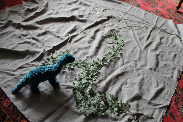
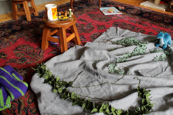
More leaves.
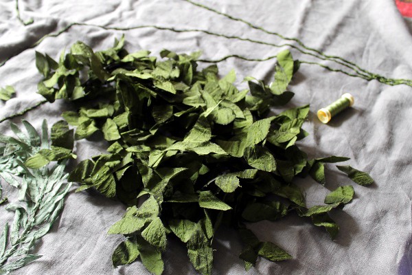
At least they’re myrtle instead of willow, which adds a (very little) variety.
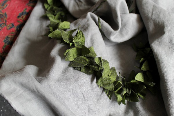
More leaves.
At least they’re myrtle instead of willow, which adds a (very little) variety.
Ah progress, could we not agree to a more linear approach to our adventures?
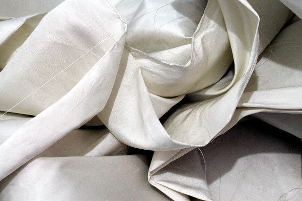
Having decided to jump in with both feet and aggressively line the bimah cloth, I’m now picking out the lining and starting again. I haven’t exactly decided how, which is a touch awkward, but at the speed I’m going with it, there’s plenty of time to work things out.
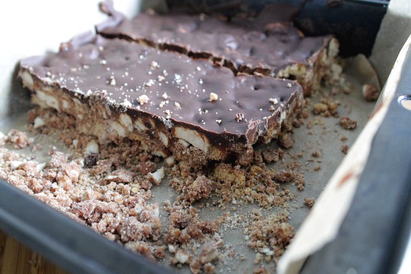
The cake of the week (quite apt, really) is Broken Biscuit Cake (or Tiffin, or Fudge Cake). It’s a rather glorious cupboard-cleaning exercise, and this particular one isn’t quite as lavish in terms of chocolate as many recipes (but still tastes like it).
4 oz butter
4 oz sugar
1 1/2 tablespoons drinking chocolate
1 1/2 tablespoons milk
1 cup fruit and nuts (or other lumpy things you’d fancy)
1/2 pound digestive biscuits, crushed in varying sizes
Grease and line a 9 inch square tin or traybake pan.
Melt butter and sugar in a pan, add drinking chocolate and milk (and fruit if using). Simmer for three minutes. Gradually add remaining ingredients and mix well. Press into the pan and cover with melted chocolate (add a half slice of toast’s worth of butter to the chocolate before you start to melt it so the chocolate doesn’t crack). Cool.
I used pretzels because LYM can’t eat nuts and I’m still undecided about putting fruit in chocolate. This one turned out a little crumbly because I didn’t measure any of the crispy bits, but if I’d stirred in a little of the melted chocolate I think it would have been perfect.
Certainly, it’s soothing my picking-out angst!
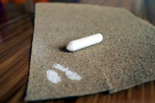
Sometimes you’re the chalk, and sometimes you’re the sandpaper. At the moment, I’m definitely the chalk.
I’m trying to get the curtain of the ark project finished and I’m mired in the doldrums of the middle third of a project where it’s obviously not finished but the novelty has worn off.
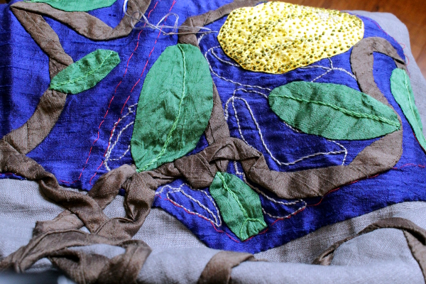
I’m slowly picking away at it, but it’s a struggle…
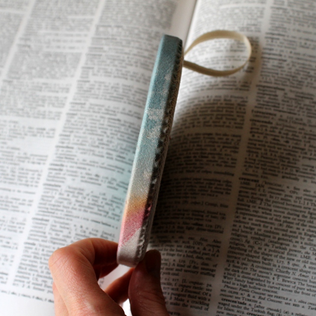
What’s your favourite word?
Here’s mine:
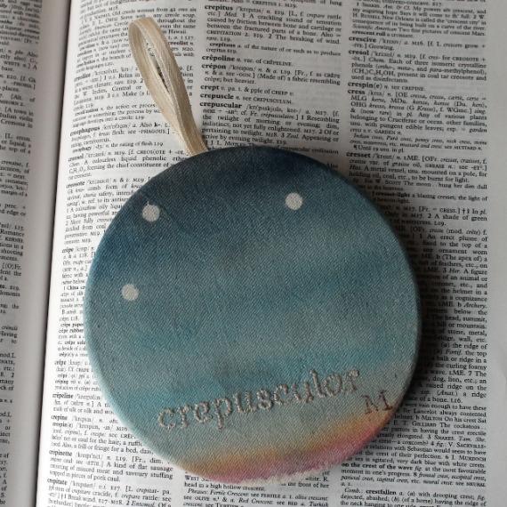
HaggardHawks (otherwise known as Paul Anthony Jones – author of Haggard Hawks and Paltry Poltroons) put out a call for favourite words for World Dictionary Day and it gave me a chance to make a piece I’ve been wanting to make for ages.
Crepuscular means active at twilight, and it mainly refers to animals…and children. It was a rather weary refrain from my mother when I was a child, and I have to say that I have found myself sighing it to myself in similar circumstances at the moment. As if that weren’t enough, Kipling has a bit of a crazy half hour around bedtime too, so we have a full house of crepuscular creatures!
I thought you might like to see how hoops get turned from flat embroideries to hoops, so here’s a little factory tour, enjoy!
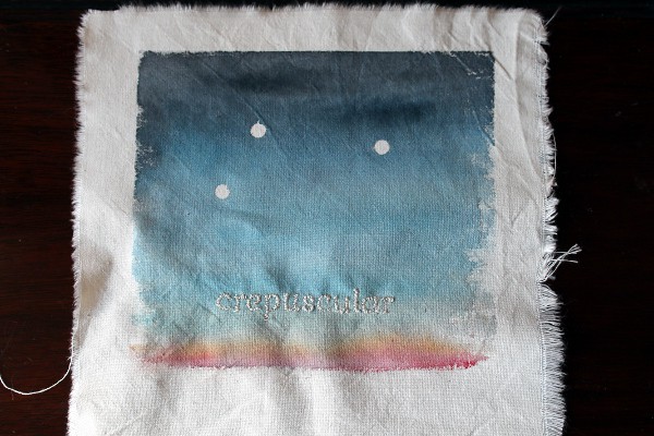
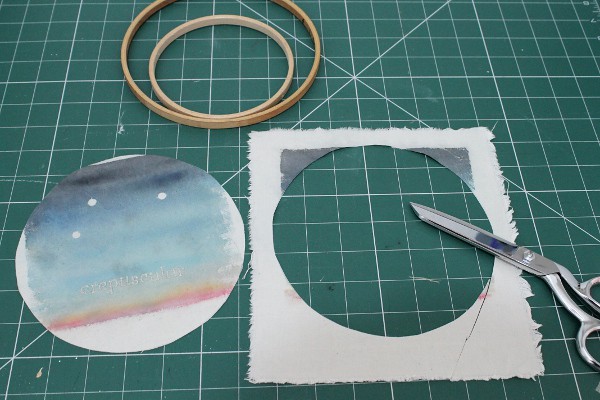
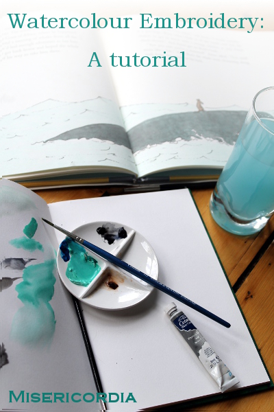
I thought I’d put together a tutorial showing you how to use watercolour with embroidery. I used this technique to make a present for my dad and I enjoyed it so much that it will shortly be making an appearance in more of my work.
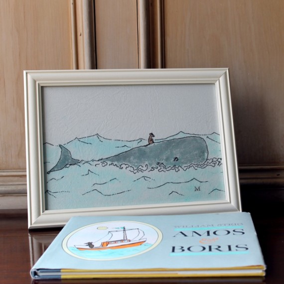
As a starter for ten (as they say), I copied an illustration so I only had to think about being faithful to the original, rather than worrying about composition and colours and balance.
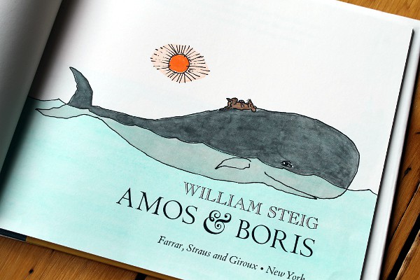
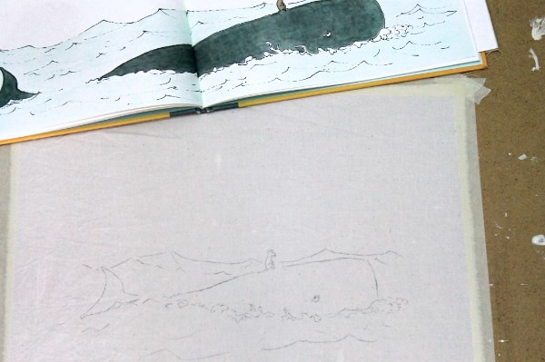
I chose the William Steig illustration from Amos and Boris below. It had a lovely wash-y sea and not too many colours to work with. I also thought that I could recreate the skips and skitters of the pen marks in embroidery quite effectively.

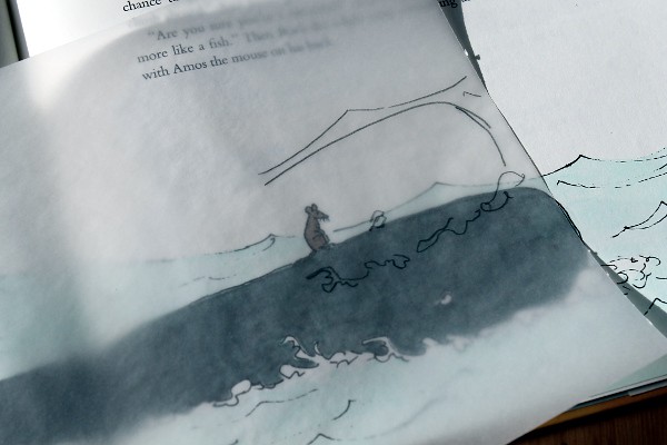
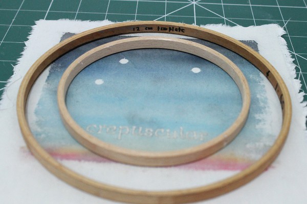
Work out how you’re going to present your piece when it’s finished. I framed mine, which gave me an idea of the size it needed to be. Watercolour doesn’t stand up to frequent washing, so keep the item’s final use in mind (not so good for a baby blanket). I had to make some adjustments to the illustration so that it would fit into the frame, but the nice thing about working onto tracing paper is that you can try things out before you commit to drawing the final lines.
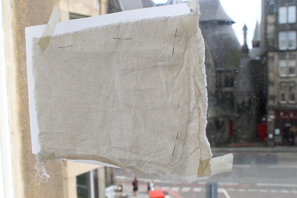
I use a super high-tech method for transferring my designs onto fabric. Pin your fabric to the front of your paper (if you used pencil, it’s a good idea to go over the lines with a dark pen). Tape the fabric and paper to a window and trace in light pencil, stopping for a rest when your arms go numb.

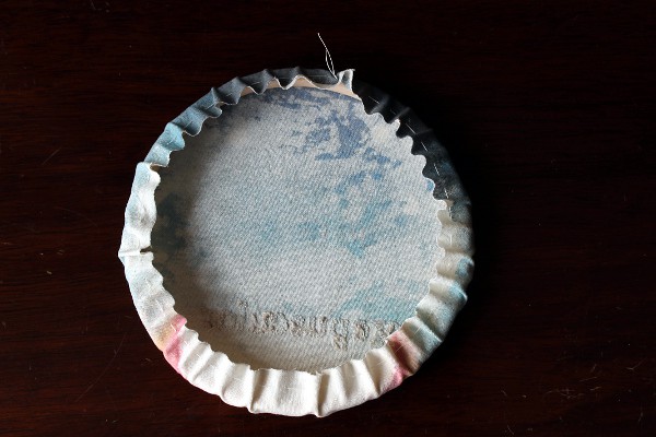
For this piece I pre-mixed my colours, I knew I had a lot of sea to colour and I didn’t want to end up with half the piece a slightly different shade than the other. I was also a little worried about getting just the right colour of sea-turquoise.
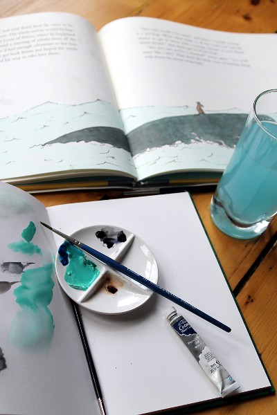
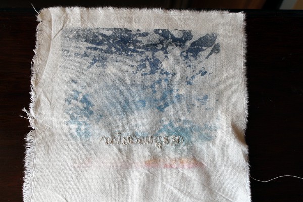
Fabric, even when it’s been pre-washed, absorbs watercolour differently than paper, so play about with a scrap to get used to it. The paint sits on top of the fabric for longer, so there’s time to dab off mistakes with a clean rag, but remember that some of the paint will wash away when you wash it, so err on the dark side (in this instance only).
Tape your fabric securely to a firm surface. It takes a few hours for the paint to dry, so make sure you have a flat surface to keep your board on while the paint dries.
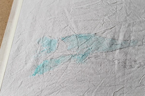
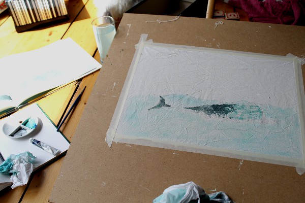
I was surprised at how long it took to cover the surface with paint, so make sure you leave plenty of time and don’t rush yourself.
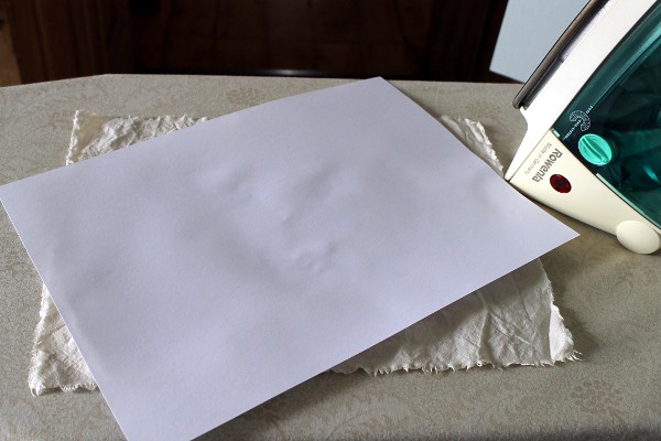
Once the paint dries, iron it to heat-set the colours. Use an iron which is as hot as the fabric allows, but make sure to put a white sheet of paper between your fabric and iron, in case a little paint transfers. (In the interests of science, I have to admit that I haven’t tried a control piece where I didn’t iron the fabric, but fabric paints are generally heat set, so it makes me feel more secure.)

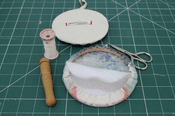
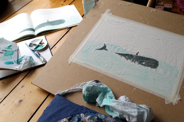
Now it’s time to get the threads out. Play with stitches, thread thickness and colours until you get the feel you’re after. If you’re using a lot of outlines or shading, look closely at how the artist used thickness and direction of marks to ensure you keep the feeling of immediacy that can sometimes be lost in the translation between drawing and embroidery.
One more tip, consider that sometimes a very dark brown, gray or blue will look better than black against the watercolours. Be brave!
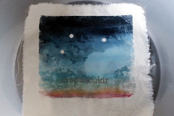
When you’re done stitching, it’s time to give your piece a wash and a starch before framing it. Use the coldest water you can, add vinegar or salt to the water and if it looks too light in places, you can always touch up the watercolours once the piece is stretched.
I hope you’ve enjoyed this tutorial, I’d love to see any pieces you make with it and please let me know if you have any questions.
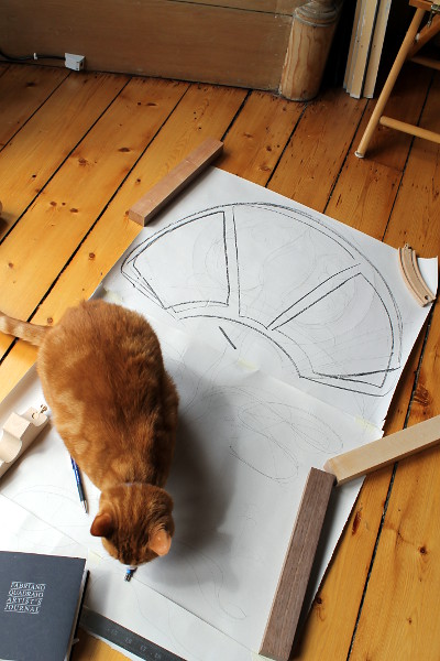
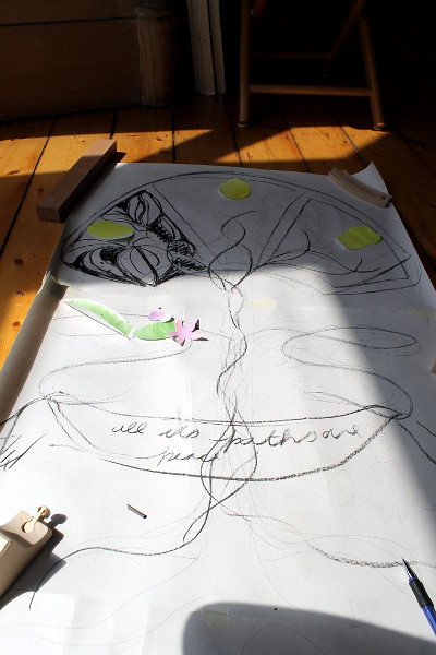
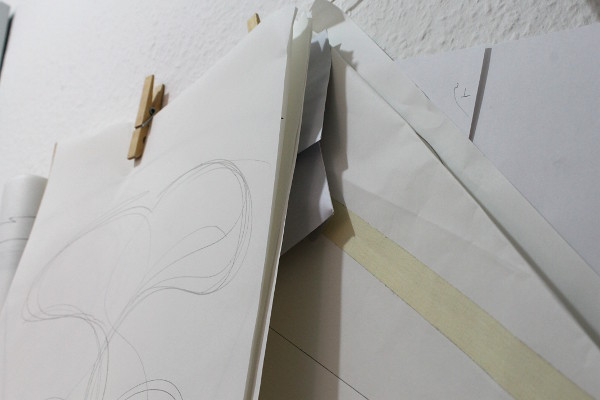
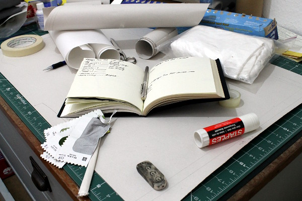
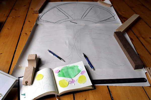
I’m in the midst of designing and making two complete sets of Torah appurtenances – Torah mantle, ark curtain and bimah cover. As usual with these things, there is a rather pressing deadline so I’m in a bit of a scramble to get things ready before we go on holiday (where I am, hopefully stitching away happily, as you read this).

I thought it might be nice to see what it looks like when I work on a larger scale – I’ve got used to being able to work on a nice civilised kitchen-table scale, but this time I’ve got rolls of paper everywhere and I’ve commandeered the train sidings, much to the disapproval of the station manager.
I’m sure I’ll be writing more about it, but for now, here is the first installment of the photo diary.
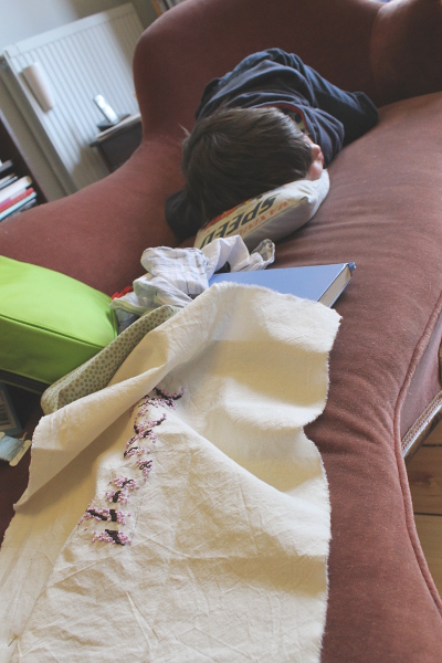
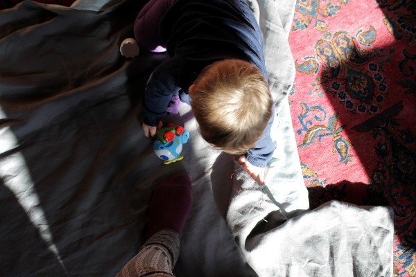
This week’s snapshot is brought to you by impending deadlines and a wee Dragon with chicken pox.
Hope you all have a lovely (and itch-free) weekend!
Copyright © 2024 Misericordia
Theme by Anders Noren — Up ↑